Activity
Mon
Wed
Fri
Sun
Sep
Oct
Nov
Dec
Jan
Feb
Mar
Apr
May
Jun
Jul
Aug
What is this?
Less
More
4 contributions to Clief Notes

Jun 5 •
Every AI coding agent keeps building the same website.
I got tired of seeing it, so I built a fix. Ask Claude Code, Cursor, Codex, Gemini, whatever, to “build me a landing page.” You already know what comes back. Purple gradient. Inter. Centered hero. Three cards. Pill buttons. Maybe some glassmorphism if it is feeling fancy. That is not really the model being stupid. It is the model doing exactly what you asked it to do with no taste constraints. If you leave every design decision blank, the model fills those blanks with the average of the web. And the average of the web looks like slop. The thing I kept noticing is that there is not just one kind of AI slop. There are three: 1. The look Purple gradients, beige editorial templates, generic SaaS polish. 2. The structure Centered hero, three-card grid, equal sections, nothing with a real layout opinion. 3. The copy “Delve,” “in today’s fast-paced world,” “not just X, but Y.” You do not fix that by asking the model to “make it better.” That just gets you cleaner slop. You fix it by removing the blanks before the model starts guessing. So I built tastecheck. It is a free MIT skill pack for AI coding agents. The main skill does not just clean up bad UI after the fact. It interviews you before the build starts. It asks opinionated questions like: - What site would you actually be okay resembling? - Are we going warm or cool? - What is the one dominant color? - What should this feel like to use? - What are we absolutely not doing? Then it turns those answers into a real design direction: type, color, tokens, layout rules, interaction states, accessibility checks, and the rest of the system the agent should follow. The pack has 14 skills total: - typography - color - layout - responsive behavior - component states - forms - dark mode - motion - empty states - data visualization - accessibility - cognitive accessibility - design review - and the main taste interview The test I care about most: I took the same content and ran it through five different design systems.


3 likes • Jun 5
i love the technically beautiful way you identified and solved the problem. good on you, @Simon Gonzalez De Cruz

May 9 •
Just Dropped - Secret Code Behind Better Results
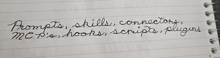
Most people think they have an AI problem. What they actually have is a packaging problem. You don’t need to become a developer to use AI effectively. This guide breaks down the real “code” behind better results: prompts, skills, connectors, MCPs, hooks, scripts, and plugins — and shows you exactly when (and why) to use each one. Check it out in Davids Corner: https://www.skool.com/cliefnotes/classroom/c7f102c7?md=9a0d198e1c0140578f37f1c93873c2b6
1 like • May 14
i just found this @David Vogel thank you. i was getting very lost as every concept is new. feels like i'm in another world of efficiency. i'm moving from the 80/20 rule and discovering 60/30/10.

👑
Mar 2 •
Who's here? Drop your intro.
Tell us three things: 1. What you do (job, industry, student, career-changer, whatever) 2. What brought you to Clief Notes 3. One thing you're trying to figure out right now related to computing or AI I'll respond to every single one. And read each other's intros too because the person who's stuck on the same problem as you might already be in this thread. I'll go first I am Jake, I have been working in tech for 15 Years, building with Generative AI for 3 Years straight now! Excited to teach and learn! That's it. Simple, scannable, gives you data on who's joining and what they need, and keeps the feed clear for content that retains people past week one.
1 like • May 1
Hi. This grandma saw your yt content and is interested in learning foundations so I can solve parenting pain points with efficient tools. I've been told my job will be gone next year so need to learn new skills. I don't like the garbage i get from AI today. That would be because I'm non-techie and don't know the tools/architecture/structure. I don't think like a computer so I don't know how to prompt it or get it to work for me . But I want to. I need to know what I need to know (i don't know if that's folders, phython, js, vs, rag, vibe or terminal etc. - these are meaningless flat words to me but everyone else building with AI seems to grasp how they fit, fast) to have AI help me build out systems, solutions, and just bloody create good, usable stuff.
1 like • May 1
@Carla Bosteder agreed. i'm in the classroom now. starting on foundations. i've played with all the llm's asking stuff and building files and plans that i just have not executed. i'm ready to. good to know you're here and there's a way through this.
1-4 of 4
Active 28m ago
Joined May 1, 2026
West Coast BC
Powered by